Tues 1/18:
DO NOW: MUTATION #1 - Mutant You
Part 1: THE PHOTOSHOOT- Have someone in class help you take a photo of yourself.
- Pose for the photos with the white background, face straight forward, like you are taking a passport photo.
- include your entire head, neck, and shoulders
- POST "before" photos in Google Classroom Assignment
The overall concept is to use your ninja-like Photoshop (Photopea.com) skills to mess with your own head. Your goal is to generally keep it within the realm of believability. You want to fool the eye. You want the viewer to wonder how you did it because your Photoshop skills are so good that they are nearly invisible.
- Have someone in class help you take a photo of yourself.
- Pose for the photos with the white background, face straight forward, like you are taking a passport photo.
- include your entire head, neck, and shoulders
- POST "before" photos in Google Classroom Assignment
Part 2: The MUTATION
Use a wide variety of skills shown below. Combine skills and techniques. I'm not requiring a certain amount of skills per attempt...but for those of you who like to count, then be sure that you don't turn in anything with less than 3 techniques/tweaks/skills.- Take your selfie on a plain background (white works best)
- get someone to help you take your photos, a selfie will give you more work.
- take the photo from your shoulders up, facing forward
- You MUST submit 2 mutants of yourself.
- Post ALL 4 Mutants
- Get creative!
In the end, you will submit 4 Mutants, and let me know which ones are your 2 BEST mutants.Identify your favorites and write 3-5 sentences about WHY they are your most successful mutants.
YOU MUST UPLOAD YOUR PSD files to your GOOGLE DRIVE. I WILL BE CHECKING YOUR WORK.
"A" projects demonstrate "A" level content, skill, effort, initiative, and craftsmanship.
POST: Jpeg to Google Classroom Assignment by end of class today 1/18
- Take your selfie on a plain background (white works best)
- get someone to help you take your photos, a selfie will give you more work.
- take the photo from your shoulders up, facing forward
- You MUST submit 2 mutants of yourself.
- Post ALL 4 Mutants
- Get creative!
YOU MUST UPLOAD YOUR PSD files to your GOOGLE DRIVE. I WILL BE CHECKING YOUR WORK.
____________________
Wednesday, 12/16:
Vintage Poster Art
Create in Adobe Photoshop CS5
Follow the instructions on the following link:http://designstacks.net/create-vintage-poster-art-using-photoshop-cs5
PHOTO CHOICES:
- Yourself
- a friend or family member
- a famous celebrity or sports figure
- a history or political figure
- a teacher or coach from school
TIPs:
- When image searching in Google Images, GO TO > TOOLS > SIZE > LARGE
- Use images with no watermarks
DUE: End of Block, FRIDAY 12/17
Minor Assignment
____________________________________________________
Happy Monday! 12/13 -
Photoshop #6 Light Burst
Complete the LIGHT BURST tutorial in Photoshop. You MUST use your FIRST NAME and LAST NAME!!When complete post your jpeg to the Google Classroom assignment. Due end of block Monday 12/13
Weds 12/8
Complete the following tutorial, when complete, post to your Google Classroom Assignment (MINOR GRADE) due at the end of block.
Photoshop Tutorial #5: Blemishes
In this Photo Retouching tutorial, we’ll look at one of the most amazing and time saving photo retouching tools available, the Spot Healing Brush, the first of three image "healing" tools in Photoshop.
DOWNLOAD an image from your Google Assignment and follow the tutorial below this photo.Follow the STEP BY STEP TUTORIAL. Use a photo you already have on your phone or take a selfie. You will have to show a before and after photo for a grade.
Save and Post to your Google Classroom Assignment (Minor Grade)
DUE END OF BLOCK TODAY - NO LATES!
Monday 12/6
Eye Color Change - MINOR GRADE
DUE TODAY, End of Block
Complete the following tutorial in Photoshop, when complete, post to Google Classroom Assignment
Don't it make my brown eyes...Don't it make my brown eyes...Don't it make my brown eyes blue...
Today, you will be changing your own eye color. Please follow this great tutorial to make your eyes 3 different colors, 2 realistic and one fantasy.
Instructions:1. Take a close up photo of one of your eyes, ask a friend to help if needed.2. Download the image to your desktop and open in Photoshop 3. Resize the image to 4" x 6" at 300 dpi 4. Follow the directions in the video5. Save each eye as a jpg and post to your Google Classroom Assignment. 6. If you want to get fancy, combine all 3 into one image and save as a jpg7. Post to your blog in the MINOR section.
Photoshop Tutorial
Try this video on how to change eye color in Photopea.com
FRIDAY: TODAY, you will be "paint by numbers" the following masterpieces
Paint by Numbers - Adobe Photoshop Tutorial
Instructions:
- Download (2) two worksheets JPEGs from the choices available in your google Classroom assignment.
- Open Adobe Photoshop
- File > Open > Choose the location and files you want to work with
- Using the magnifying glass tool at the bottom of your toolbar, zoom in on the top of the page
- In the first box labeled (1), its says LIGHT BROWN (on my example, your choice might say another color). You need to select a LIGHT BROWN color.
- Double click the COLOR PICKER (Eye Dropper Tool) and a new window will open, select the color you are looking for - CLICK OK
- Click on the RECTANGLE SELECTION TOOL (the dotted marquee tool) and select the area in the box around the number 1
- Go to you the PAINT BUCKET TOOL ( it is also has the gradient tool, click on bottom right of tool to select Paint Bucket Tool
- Click in the area around the number 1, it will fill the space with the color you have in your COLOR PICKER.
- Its ok if the numbers are still visible but you can cover the number if you'd like
- Now go to a each section that has the number 1 in it, with your PAINT BUCKET TOOL selected, click in the area, it will fill the area with the color in your COLOR PICKER
- Fill in all the boxes with the same number
- Move onto the next box number 2, and repeat the process
- If you need to re-select a color, you can use the EYE DROPPER TOOL to select the colors in the top boxes
- Complete your paint by numbers
- EXPORT as JPEG and POST to your Google Classroom Assignment
- You must complete 2 Paint by Numbers by the END OF BLOCK TODAY!
____________________
- Download (2) two worksheets JPEGs from the choices available in your google Classroom assignment.
- Open Adobe Photoshop
- File > Open > Choose the location and files you want to work with
- Using the magnifying glass tool at the bottom of your toolbar, zoom in on the top of the page
- In the first box labeled (1), its says LIGHT BROWN (on my example, your choice might say another color). You need to select a LIGHT BROWN color.
- Double click the COLOR PICKER (Eye Dropper Tool) and a new window will open, select the color you are looking for - CLICK OK
- Click on the RECTANGLE SELECTION TOOL (the dotted marquee tool) and select the area in the box around the number 1
- Go to you the PAINT BUCKET TOOL ( it is also has the gradient tool, click on bottom right of tool to select Paint Bucket Tool
- Click in the area around the number 1, it will fill the space with the color you have in your COLOR PICKER.
- Its ok if the numbers are still visible but you can cover the number if you'd like
- Now go to a each section that has the number 1 in it, with your PAINT BUCKET TOOL selected, click in the area, it will fill the area with the color in your COLOR PICKER
- Fill in all the boxes with the same number
- Move onto the next box number 2, and repeat the process
- If you need to re-select a color, you can use the EYE DROPPER TOOL to select the colors in the top boxes
- Complete your paint by numbers
- EXPORT as JPEG and POST to your Google Classroom Assignment
- You must complete 2 Paint by Numbers by the END OF BLOCK TODAY!
MONDAY 11/29 - It's PHOTOSHOP TIME!!!
View the following intro and complete instructions below:
Photoshop Tutorial 2 - MINOR GRADE
Masking Please complete the following tutorial and save as JPEG and post to you blog. For HW, comment on everyone's Blog posts.
- You will need to open Adobe Photoshop
- ZIP file of the assets you will need is located in the Google Classroom Assignment.
- Download and EXTRACT the files
- Go to Start and Find Adobe Photoshop, it will either be in your top list of applications or you will need to find it in the Adobe folder.
- Minimize the screen so you have can have both windows open, one to watch the video and the other to look at the application.
- Save whatever you created today as a JPEG
- Post me on your Blog for a minor grade
http://www.digitalartsonline.co.uk/tutorials/photoshop/advanced-compositing-techniques/
______________________
Monday, 11/15/21 - Rotoscoping
What is ROTOSCOPING?
When you use actual VIDEO as a reference, you can trace frame by frame to create VERY impressive movement.
Instructions:
- RECORD a 10 second video of human motion - ideally YOURS so that you can use the animation as an avatar later - try to create a "seamless loop" (Check your Cellphone Settings BEFORE you shoot! SEE INSTRUCTIONS BELOW)
- Use the instructions below to prepare and import your video into the Wick Editor as a REFERENCE layer
- Follow the appropriate instructions to Trace over "Key Frames" with the BRUSH tool, then hide the reference layer and export your Rotoscope as an Animated GIF
TIPS:
- Try a SIMPLE, SHORT test BEFORE you commit to your main project VIDEO
- Keep your camera steady - rest it on a stable surface, tripod, or stand
- Think of movement that will result in a creative, expressive, and seamless loop ANIMATION
- Choose Significant "keyframes" to illustrate first, then go back to fill in the tweens to add extra detail to the movement
- Keep it SIMPLE - Hair, Eyes, Eyebrows, Mouth, Nostrils; Just use blobs, not fine lines!
- TAKE A BREAK - SAVE OFTEN - use UNDO when you need to. Get up, walk away and come back to it!
How to Convert Video to Stills for the Wick Editor App
- Shoot your reference video in a short, low res format ie on your laptop or mobile device. Transfer the file to your computer using Google Drive.
- Convert the video into individual image frames using a utility like https://ezgif.com/video-to-jpg
- Upload an MP4, MKV or MOV file
- Set the appropriate START TIME and END TIME so that you just convert the part that you need
- Set the SIZE to AUTOx480 and the FRAME RATE to 20 FPS
- Click CONVERT and images will start to appear
- SCROLL DOWN to the bottom to download the packaged images as a ZIP file
- Open the ZIP file, then DRAG or COPY the images to an appropriate folder on your computer, or in Windows Explorer, Right Click the Zip folder and Select EXTRACT ALL
- Create a new Wick Editor project sized to 450x450 pixels and 24fps
- UPLOAD the images into Wick as reference graphics, and add only the first couple of images. Name that layer "Reference" -
- Create another layer called "Guidelines" above the reference layer, and draw guidelines there to help you line up your images as you drag them into the reference layer.
- Now continue drag reference images to new keyframes and line them up with your guidelines.
- Lock the reference layer, hide the guideline layer, and Create a final layer for you to start sketching in!
REQUIREMENTS:- Technical Specifications
- 500 x 500 pixel size
- 24 FPS
- Animated GIF format
- NAME file properly: FIRSTNAME_Rotoscope1
- Effectiveness
- Clear Illustration
- Temporal Resolution - enough unique frames drawn to create believable motion
- Creativity
- Smooth Seamless Looping
- Initial Frame would make a good static avatar
- Shoot your reference video in a short, low res format ie on your laptop or mobile device. Transfer the file to your computer using Google Drive.
- Convert the video into individual image frames using a utility like https://ezgif.com/video-to-jpg
- Upload an MP4, MKV or MOV file
- Set the appropriate START TIME and END TIME so that you just convert the part that you need
- Set the SIZE to AUTOx480 and the FRAME RATE to 20 FPS
- Click CONVERT and images will start to appear
- SCROLL DOWN to the bottom to download the packaged images as a ZIP file
- Open the ZIP file, then DRAG or COPY the images to an appropriate folder on your computer, or in Windows Explorer, Right Click the Zip folder and Select EXTRACT ALL
- Create a new Wick Editor project sized to 450x450 pixels and 24fps
- UPLOAD the images into Wick as reference graphics, and add only the first couple of images. Name that layer "Reference" -
- Create another layer called "Guidelines" above the reference layer, and draw guidelines there to help you line up your images as you drag them into the reference layer.
- Now continue drag reference images to new keyframes and line them up with your guidelines.
- Lock the reference layer, hide the guideline layer, and Create a final layer for you to start sketching in!
- Technical Specifications
- 500 x 500 pixel size
- 24 FPS
- Animated GIF format
- NAME file properly: FIRSTNAME_Rotoscope1
- Effectiveness
- Clear Illustration
- Temporal Resolution - enough unique frames drawn to create believable motion
- Creativity
- Smooth Seamless Looping
- Initial Frame would make a good static avatar
DUE DATES: (-5pts for every day late)
3 MINOR GRADES & 1 MAJOR
- MONDAY. 11/15 by 3pm: Film Video and Upload to Google Assignment (Minor Grade)
- TUES. 11/16 BEFORE CLASS BEGINS: Convert Video to Stills in https://ezgif.com/video-to-jpg (Minor Grade)
- Save to your Google Drive
- Begin working in Wick Editor App (instructions above)
- WEDS. 11/16: EXPORT VIDEO (in Wick Editor) of your progress (Minor Grade) even if you are not done.
- Continue working on illustrations
- THURS. 11/17: FINAL GIF DUE (MAJOR GRADE)
VIDEO TUTORIAL: Converting Video to Stills and Rotoscoping in the Wick Editor App
- MONDAY. 11/15 by 3pm: Film Video and Upload to Google Assignment (Minor Grade)
- TUES. 11/16 BEFORE CLASS BEGINS: Convert Video to Stills in https://ezgif.com/video-to-jpg (Minor Grade)
- Save to your Google Drive
- Begin working in Wick Editor App (instructions above)
- WEDS. 11/16: EXPORT VIDEO (in Wick Editor) of your progress (Minor Grade) even if you are not done.
- Continue working on illustrations
- THURS. 11/17: FINAL GIF DUE (MAJOR GRADE)
How to SET UP your phone
- RESOLUTION: Look under your camera settings, and try to set it to a low resolution no more than 1080p (1920x1080 pixels) - you DON'T want the files to get too big! DON'T use 4K or 60fps!
- AVOID HEVC: IF you have an iPHONE, there is a troublesome movie format called HEVC that can cause problems in editing. iPhone users should check their settings BEFORE THEY SHOOT to avoid this format. Here's how:
- Go to Settings > Camera.
- Tap Formats.
- Tap Most Compatible. This setting is available only on devices that can capture media in HEIF or HEVC format, and only when using iOS 11 or later.
- Use the proper TECHNIQUES
- Pay attention to the background
- Frame in LANDSCAPE orientation just above the head to just below the chest
- Shoot outdoors for better LIGHTING, and pivot to see what light angle (and background) looks best
- Look directly into the lens
- Find a QUIET location, and consider using your earbuds as a microphone
- Transfer the files
- Install the GOOGLE DRIVE app on your phone
- From your phone's photo album, select a video clip and click the SHARE icon. You should see the Google Drive icon as a destination
- Specify which account, which drive folder, and what filename you'd like to send the file to.
- Make it easy to find - create a new folder called UPLOADS
- Go to Settings > Camera.
- Tap Formats.
- Tap Most Compatible. This setting is available only on devices that can capture media in HEIF or HEVC format, and only when using iOS 11 or later.
- Pay attention to the background
- Frame in LANDSCAPE orientation just above the head to just below the chest
- Shoot outdoors for better LIGHTING, and pivot to see what light angle (and background) looks best
- Look directly into the lens
- Find a QUIET location, and consider using your earbuds as a microphone
- Install the GOOGLE DRIVE app on your phone
- From your phone's photo album, select a video clip and click the SHARE icon. You should see the Google Drive icon as a destination
- Specify which account, which drive folder, and what filename you'd like to send the file to.
- Make it easy to find - create a new folder called UPLOADS
Friday, Oct 29th
Good morning! Today you will be creating a new animation. - Please use the images above for references on how to animate your stick figure Running and Jumping.
- Be CREATIVE!
- add a background color
- you can also google search "Animation Run or Jump Cycle" for more references.
- Follow this video tutorial below to create your Running/Jumping Stick Figure Animation.
- Save as Wick file and upload to your Google Drive
- EXPORT as VIDEO (mp4) and post in the Google Classroom Assignment.
- Due by end of block Monday when we get back from break :)
- Please use the images above for references on how to animate your stick figure Running and Jumping.
- Be CREATIVE!
- add a background color
- you can also google search "Animation Run or Jump Cycle" for more references.
- Follow this video tutorial below to create your Running/Jumping Stick Figure Animation.
- Save as Wick file and upload to your Google Drive
- EXPORT as VIDEO (mp4) and post in the Google Classroom Assignment.
- Due by end of block Monday when we get back from break :)
VIDEO TUTORIAL
Animation Vocabulary
Now that we covered the basic idea of what animation is, it's important to understand the vocabulary and specialized terms used in the animation and filmmaking industry.
Write these Vocab words on paper, take a photo of your work and POST to the GOOGLE CLASSROOM Assignment - DUE Today by 2:30pm (Tues 10/26)
Timeline
The timeline is the part of the animation software that represents the animation's progress over time.

Depending on the software, we might use the timeline to make changes to the timing of the animation, as well as the position of the elements.
The timeline is the part of the animation software that represents the animation's progress over time.

Depending on the software, we might use the timeline to make changes to the timing of the animation, as well as the position of the elements.
Frame Rate
The frame rate of an animation is the number of individual images (or frames) that are being displayed over the span of one second. It is a setting you can adjust in the animation software.
Animation is usually done in 24 frames per second (FPS).
The frame rate of an animation is the number of individual images (or frames) that are being displayed over the span of one second. It is a setting you can adjust in the animation software.
Animation is usually done in 24 frames per second (FPS).
Shots & Scenes
Normally in live-action filmmaking, the term 'shot' refers to the images between camera edits, while a scene is all the shots and dialogue that take place at a particular location for a continuous block of time.
In animation, however, we often use the term 'scene' and 'shot' interchangeably. When we talk about a scene/shot, we often refer to one specific continuous piece of animation in between camera cuts.
Keyframes | Breakdowns | Inbetweens
Key frames, breakdowns, and in-betweens are important terms, but they mean slightly different things depending on the type of animation.
In hand-drawn animation, keyframes (or just keys) are the major important poses that define the scene. Breakdowns come between keys and define what the motion from key to key will be. In-betweens are all the frames that come in between to smooth out the motion.
In 3D, a keyframe is any position on the timeline where the animator has defined the position of the character. In-betweens are all the frames that the computer interprets or automatically generates to move the character from key to key.
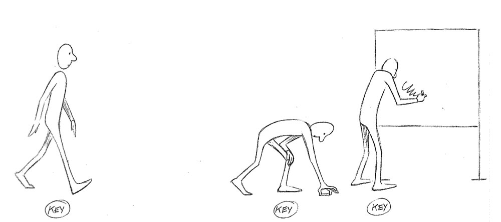
KEYFRAMES
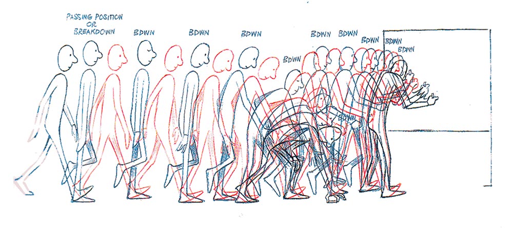
BREAKDOWNS
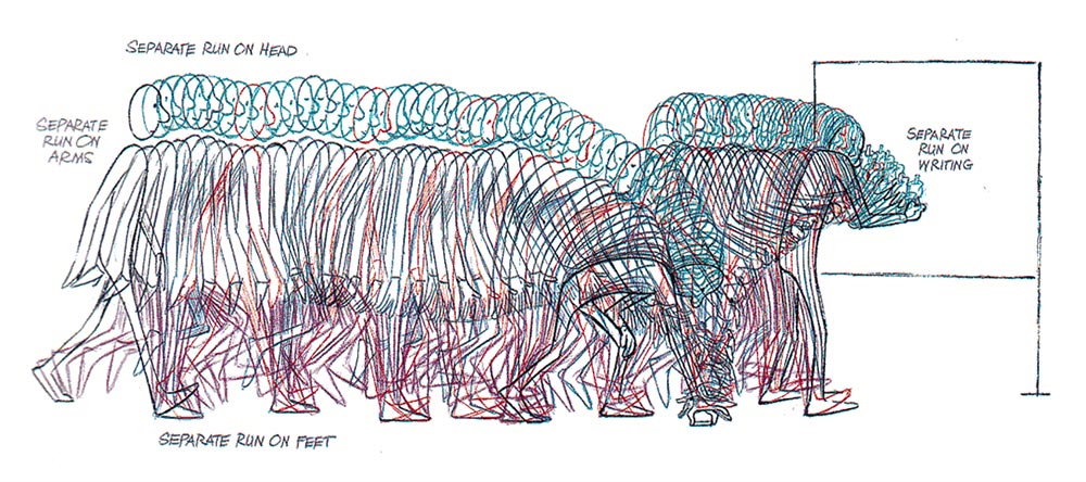
IN-BETWEENS
Timing | Spacing | Easing
Key frames, breakdowns, and in-betweens are important terms, but they mean slightly different things depending on the type of animation.
In hand-drawn animation, keyframes (or just keys) are the major important poses that define the scene. Breakdowns come between keys and define what the motion from key to key will be. In-betweens are all the frames that come in between to smooth out the motion.
In 3D, a keyframe is any position on the timeline where the animator has defined the position of the character. In-betweens are all the frames that the computer interprets or automatically generates to move the character from key to key.

KEYFRAMES

BREAKDOWNS

IN-BETWEENS
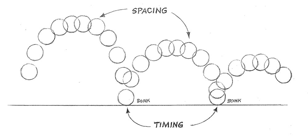
Timing, spacing and easing are closely related terms.
Timing means the total number of frames that will be used for a movement. Spacing is the amount of change that comes between each frame. Decreasing the spacing, makes an object slower, while increasing the spacing makes it look faster.
In digital animation, easing is how spacing is controlled, usually through a motion graph on the timeline.

Onion Skinning
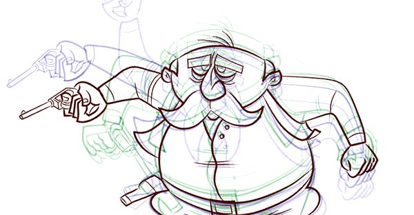
When animating, it's very useful to be able to see more than one frame at a time.
In paper animation this is done by having multiple drawings on a light table, but in modern animation programs there's often a feature called onion skinning. It lets you see semi-transparent representations of the frames behind or ahead of the current frame you're working on.

Compositing
Compositing is the process of putting all the individual pieces of a scene together to create the final visual output.
You might have a background, multiple characters, and some scenery all being developed separately. Compositing is how all those pieces get put together into a single scene.
Compositing is the process of putting all the individual pieces of a scene together to create the final visual output.
You might have a background, multiple characters, and some scenery all being developed separately. Compositing is how all those pieces get put together into a single scene.
Friday 10/22
Tuesday, 2/9: STORYBOARDING
The Function of Storyboards
MINOR ASSIGNMENT: REVERSE STORYBOARD
Instructions:
- Play and pause on each shot from the provided clip, and draw what you see, indicate any camera moves, changes in poses and expressions, recreate the poses, framing and subject placement for every shot. 50-60 panels.
- Keep it rough and simple, imagine you are reverse-engineering the sequence as you break down these shots to storyboard them. Think about the pacing and editing, why the shots are framed the way they are, where the negative space is, when and why does it go to close-ups, and where is the main focal point in each shot.
- As you go, illustrate the compositional elements used to direct and lead the storytelling.
- Think about how the camera was used to draw out your initial emotional response and visual language to the scene.
- Due: Friday, END OF BLOCK
WEDS 10/20
TODAY - we are going to BRAINSTORM and begin our STORYBOARD
We will begin to create the first part of an illustration that we will animate.
- Brainstorm: what do you want to animate?
- Yourself as a cartoon, a new super hero, a manga character you have already designed? or maybe you want to re-create a character from a book or film.
- Create your script: write a quick series of actions and plot of your animation. Decide what you want your main character to be and then think about what you want it to do in a 10 sec video (it can be longer if you'd like)
- is it a short story? a commercial? an infographic (a how-to)?
- Where does it take place?
- Is it outside, in a scary venue, in an office space, at school, in a sci-fi fantasy world?
- Write 1-2 descriptive paragraphs, POST to Google Assignment (Due today)
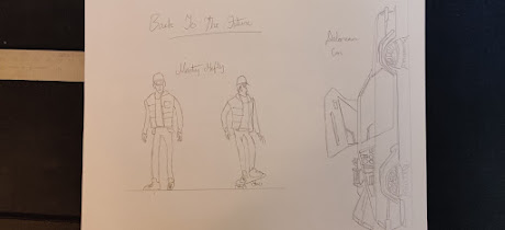
3. Create your rough draft of your character
- Draw your character on Paper
- Think about different angles, walking, sitting. etc.
- Think about how you are going to animate your character
- What type of background, landscape, world do they exist in
- Photograph your Character and POST to Google Assignment (Due Thursday)
4. Create a storyboard:
- After you come up with a great idea, shape a story and turn it into a script, it’s time for making a storyboard.
- A storyboard is essentially a series of drawings based on the script, which will be used as a visual guide throughout the rest of the animation production pipeline.
- Basically, a standard storyboard contains three main information categories:
- The sequence of scenes to tell the story
- Whatever the viewer will hear or see on the screen
- The technical information provided for each scene
I simplified all that info for you. Obviously, we are going to take this step by step. TODAY - we are going to BRAINSTORM and begin our STORYBOARD
- Draw your character on Paper
- Think about different angles, walking, sitting. etc.
- Think about how you are going to animate your character
- What type of background, landscape, world do they exist in
- Photograph your Character and POST to Google Assignment (Due Thursday)
4. Create a storyboard:
- After you come up with a great idea, shape a story and turn it into a script, it’s time for making a storyboard.
- A storyboard is essentially a series of drawings based on the script, which will be used as a visual guide throughout the rest of the animation production pipeline.
- Basically, a standard storyboard contains three main information categories:
- The sequence of scenes to tell the story
- Whatever the viewer will hear or see on the screen
- The technical information provided for each scene
Due Dates:
10/20 WEDS - Brainstorm & Script: Brainstorm notes, plot, write a paragraph about your character and the plot line of your 10 sec animation. (POST in the google classroom assignment)________________________________
MONDAY!!!! 10/18/21
Introduction to Animation: The Wick Editor, The 12 Principles of Animation and The Dot and the Line
For this project, you will be using the Wick Editor. You will not need any other materials other than your desktop or Chromebook to complete this assignment.Watch this video on the first principle of animation, Squash and Stretch:
ASSIGNMENT: (Minor Grade) WICK APP Tutorial #1
- In your animation, you must demonstrate an understanding of the principle of 'squash and stretch', how frame animation works and how to use layers.
- In the bottom layer, the green background, don't forget to drag the frame out so that the background is visible underneath the entire story.
- Do not export the video as a GIF. Export it as an MP4 video.
- Upload both your saved Wick Editor project and your MP4 into Google Classroom.
- Remember, you will need to save the Wick Editor project to your Chromebook to be able to reopen it and continue working on it.
- Do NOT HIT SUBMIT until you have uploaded both your finished Wick Editor project and your MP4 to Google Classroom.
- DUE: TUESDAY 10/19
Here's an example of some dot and line videos created by Perth Amboy students:
Weds 10/6
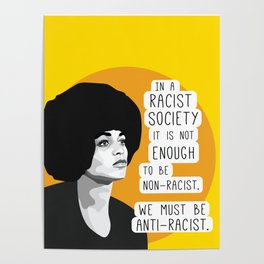
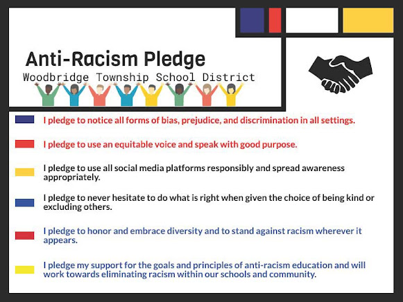
Mustangs are ANTI-RACIST! Poster Contest
Objective: Create a graphic POSTER which clearly promotes anti-racism/racial equality. (use Adobe IllustratorAt the heart of our school community is respect and acceptance for all. We aim to help you develop into global citizens who can play a positive and productive role in society. At JFKMHS we stand against all forms of discrimination.
- Think about your message. How do you want people to feel when they see your poster?
- What do you want them to remember?
- Remember to feature the No Room For Racism message, and you can also add your own keywords.
- Consider what color scheme you will use to make the most impact.
- Size: 11x17 (tabloid)
- You can use images from the internet but make it your own!!!
- Design your poster using interesting an color scheme and fonts
- Save AI file
- EXPORT as JPEG (click use artboards) and post to Google Classroom Assignment
- RESOURCES: for FREE vector images, https://www.vecteezy.com/
- you will need to create and account with your WTSD google acct
- SELECT FREE LICENSE when choosing images
- Download Free Image
- You will need to right click and select EXTRACT ALL to open the file in AI
Monday Morning.....(9/27)
3D Style Retro Text Effect Tutorial
In this tutorial you’ll learn how to create dimensional text inspired by vintage packaging designs and logotypes. Pour a cup of coffee, sit back, and let’s create some text with the help of Illustrator effects, the Blend Tool, and textures fit for the branding of a coffee house.
Final Image
Step 1
- In Adobe Illustrator, Select FILE, NEW, PRINT, US LETTER
- Start with your font of choice. In this case, I chose Lobster 2, but you choose GILL SANS MT EXT CONDENSED BOLD. FONT SIZE: 95 pts
- Write out your text or title with the Type Tool (T). I chose “Italian Roast”, but you will use your FIRST NAME
- Expand your text to outlines under Object, and then Ungroup your text.
Step 2
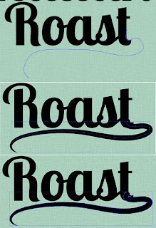
- I think on of your words needs a flourish, I chose “Roast”
- Using the Pencil Tool (N) I drew a swooping line from the letter “T” that moves to the left and stops below the “R”.
- Apply a thick stroke to the path in the Stroke panel.
- Use the Width Tool (Shift – W) to taper the tail of the flourish by placing points with the tool near the end of the tail and dragging our mouse to make the path thinner at that end.
- Once you’ve got the flourish in a position and shape that you enjoy, Expand it in Object and Group together with your word (in this case it’s been Grouped with “Roast”).

Step 3
- In order to make sure the flourish drawn in the previous step fits in with the text group seamlessly,
- Zoom (Z) in so you can work on the details of the final letter.
- I’ve used the Pen Tool (P) in order to draw a shape that hides the little kick on the end of the “T” and flows into the expanded flourish path.
Step 4
- I’ll mainly focus on the word “Italian” in this tutorial, since the process for the text treatment is the same for both word groups.
- Select the “Italian” group and hit Unite in the Pathfinder panel.
- With the newly compound shape selected, go to Effect > 3D > Extrude & Bevel and apply the following attributes:
X Axis: 7°
Y Axis: 12°
Z Axis: 0°
Extrude Depth: 50pt
Surface: Plastic Shading
- I’ll mainly focus on the word “Italian” in this tutorial, since the process for the text treatment is the same for both word groups.
- Select the “Italian” group and hit Unite in the Pathfinder panel.
- With the newly compound shape selected, go to Effect > 3D > Extrude & Bevel and apply the following attributes:
Y Axis: 12°
Z Axis: 0°
Extrude Depth: 50pt
Surface: Plastic Shading
Step 5
- With your new 3D text selected, Expand Appearance under Object and Ungroup.
- Select the face of the text (the letters without their 3D counterpart) and set the fill color to a light color: cream, pale mint, etc.
- Group together the 3D components of lettering. We’ll be adjusting the fill colors of those pieces in the following steps.
Step 6
You’ll need two colors for the 3D components of your text. In this case I chose teal and darker teal. - Using the Direct Selection Tool (A), select the bottom components of the 3D text and apply the darkest shadow color as the fill color (see below).
- For anything that is on the right side of each letter and not a part of a curve, apply the lighter shadow color as the fill color (see below).
- Using the Direct Selection Tool (A), select the bottom components of the 3D text and apply the darkest shadow color as the fill color (see below).
- For anything that is on the right side of each letter and not a part of a curve, apply the lighter shadow color as the fill color (see below).
Step 7
- For curving shapes in the 3D text, you’ll apply a Linear Gradient going from the lighter shadow color to the darker shadow color using the Gradient panel to sort out the gradient’s angle.
- I’ve circled the sections of the 3D portion of the text where the gradients were placed. Once satisfied with the shadow colors and gradients of the 3D text, make sure it’s all Grouped together and Unhide the rest of your text.
- Repeat Steps 4-7 on any other text you may have in your artboard.
Step 8
- Select the face of your text (the group from Step 5), Copy (Control – C), Paste (Control – V), and go to Object > Path > Offset Path… where you’ll apply a -1px Offset.
- With both the copied text face and the offset object selected, hit Minus Front in the Pathfinder panel. For the fill color, choose something lighter than the text’s face color (light cream, seen below). Copy and Paste this outline shape and apply a color darker than the mint used for the face of the text.
Step 9
- Place this second outline shape to the right of the light cream outline shape and below it in the Layers panel. Copy, Paste, and Align (in the Align panel) the text’s face group with itself.
- With the copied face and the green outline shape selected, hit Control-7 in order to create a Clipping Mask.
- Repeat Steps 8-9 on your other text (if applicable).
Step 10
Step 11
Step 12
Step 13
- Copy and Paste the drop shadows twice into two separate groups.
- Reduce the Opacity of the second group to 10% in the Transparency panel.
- Make sure it has been moved to the left and downward from the first group.
- Use the Blend Tool (W) to apply a smooth blend of 45 Steps.
- Place this blend group behind the drop shadows and text.
Step 14
- For the texture used over the top of the final piece, Copy and Paste the background rounded rectangle, but make sure it’s above the other layers in the Layers panel.
- Set the fill color to dark gray and go to Effect > Pixelate > Mezzotint.
- Choose Medium Lines as the Mezzotint type.
- In the Transparency panel, set the Blend Mode to Soft Light and Opacity to 43%.
Great Job, You’re Done!
You’ve done it! Your retro text has been given a kick in the right direction. Play with long shadow shapes behind the text, add in other flourishes, effects, and designs in order to take this fairly simple text effect to the next level.
Export as a PNG file and post to your Google Assignment and to your blog! DUE end of Block today 9/27
Export as a PNG file and post to your Google Assignment and to your blog! DUE end of Block today 9/27
Thursday.... its almost the WEEKEND!
Today you will work on: ILLUSTRATOR PATHFINDER PANEL
1) Complete the Tutorial below
(Open Illustrator, FILE, NEW, LETTER, then click WINDOW, click Pathfinder)
Follow step by step:
Starting with pretty basic shapes in Illustrator can end up in quite complex and interesting layouts. If you combine ellipses, rectangles and other lines you can produce complicated paths otherwise impossible (or I would rather say extremely time consuming) to achieve with the Pen tool alone. The tool needed for doing that is the Pathfinder Panel.
If we take a look at the panel we see that there are two rows of icons. The first row of icons (Shape Modes) creates compound shapes while the second one (Pathfinders) creates similar results but it focuses mainly on the paths themselves rather than the produced shape itself. Let’s see what each icon is doing.
a. Add to shape area

Supposing you have the following two rectangles.
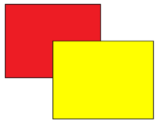
If you select both and click on this button in fact you are adding the one shape to the other resulting in a shape that combines these two rectangles.
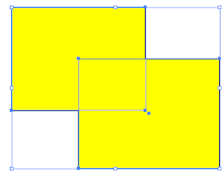
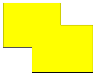
The combined result gets a yellow fill, since stacking order of the shapes is important when performing the pathfinder operations. Attributes of the top shape will be used by Illustrator for the combined result properties. By using the direct selection tool
 you can make adjustments of each one of the two shapes directly updating the resulting compound shape. For example, try moving the lower right rectangle further to the right as seen below.
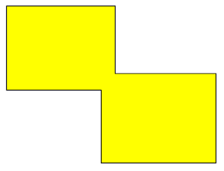
No problem… You still have the resulting shape, while you can modify each of its components individually… Cool! If you now select your shapes and click on the Expand button on the Pathfinder Panel
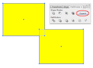
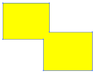
you no longer have the ability to separately manipulate each individual shape and what you get is ONE FINAL shape for further actions. If you want to add the two shapes and expand to one final shape in one step, then press and hold the ALT key and click on the add button. It saves you time, as long as you are sure about the final shape.
b. Subtract from Shape Area

Let’s go back to our two initial rectangles.

If you select both and click on the Subtract button, then you subtract the top most shape from what lies beneath it. So if you perform the operation you get the following result.
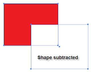
Like before, you can adjust the appearance of the resulting shape by editing each one of the components separately. Here, with the direct selection tool I’ve moved the subtracted shape diagonally towards the upper left corner.
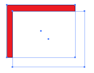
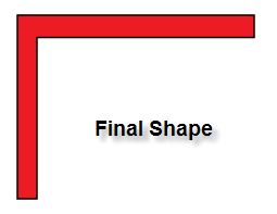
Click on the expand button and you get the final ONE shape.
c. Intersect shape areas

If we select the two rectangles again, and click on the Intersect button, we get a compound shape that is only the Intersecting area of the two rectangles. Click on the expand button and you produce a small yellow rectangle.
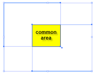
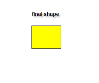
d. Exclude overlapping shape areas

If we click on the exclude button, then we get the inverse result. We have a shape with an empty area. This area is the overlapping area of both rectangles. Do it and you’ll end up with the following shape.
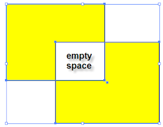
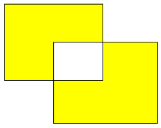
FRIDAY FRIDAY FRIDAY!!! (9/17)
1. Go to https://www.youtube.com/c/JFKMHSTV - SUBSCRIBE
2. Finish CHEESEBURGER
3. Begin FONT project - Instructions located in MINOR Assignments (I will demonstrate)
Weds., 9/14:
After you complete your ASSIGNMENT: Part 1: Selection, Patterns, Gradients,You will begin your first MINOR ASSIGNMENT, located in the Minor Tab of this blog. I will demonstrate to the class and then you will create your own Illustration of a CHEESEBURGER!
Weds., 9/8 GOOD MORNING!!!
SPECS:
- About Me Home Page (tell everyone about yourself, add photos, discuss likes and interests)
- Minor Assignments (you will post your work here in the short future)
- Major Assignments (you will post your work here in the short future)
- Change colors
- Use your own photography or illustrations (do not use stock photos)
- Go to Themes > Customize
- Change Fonts
Instructions on How to Create a Blog in Blogger.com:
Your Blog name should include Your First Name and Your Last Name Initial, for example:
www.JoeT-JFKGD1.blogspot.com
You will be required to create and maintain your personal blog, while adhering to the internet rules and regulations you've signed off on in order to participate in this course.
Think of your blog as your sketchbook, your very PUBLIC sketchbook.
We'll start blogging together, but if you need the instructions, google has very detailed instructions which you can view at home this evening and continue this process at home..









No comments:
Post a Comment